A walkthrough that brings you a popular "grunge"-style effect.
[webign nav]
to main index
to pro index
PhotoShop Effects: Grunge to Grunge
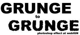
Right. Grunge effect. One way of getting it is using the ready-made fonts, but what I am going to show you is a technique that lets you create your own grunge-style letterings (see the picture) plus you can use the technique on other graphic elements.
1. Run Photoshop, create a file 400x400 pixels, RGB, 72 dpi, white background.
2. Choose black colour as a foreground, choose the type tool, type whatever you want, the size of the font can be whatever you want, but it works better with larger and thicker fonts/sizes. The font I used to produce the image above is Arial Black (size: 40 points), which came as a part of my Windows95.
3. Now flatten the image. You will end up with a white background which has a black text you've written on it.
4. So far, so good. Now let's add a noise filter. Make sure you check the "monochromatic" setting (otherwise we will get a coloured noise). You can experiment with the amount setting, but something like 90 will be ok. Let's also Blur the image. Again, it is not absolutely necessary, you can experiment with the settings later on.
5. Now let's go to Image -> Levels (Ctrl-L). Now, there you will see three triangles (black, grey, white). When you move white to the left, you make the image lighter. Move the white triangle to the left until you can see no noise in the background. Move the black a bit to the right. The figures in my levels window (three figures in total, just above the graph window) say 17, 0.72, 155. Click Ok.
6. The following bit lets you make the letters look more "grunger". You can completely skip this step, but I found that the effect is nicer if you don't. Choose the Diffuse filter, choose "darken only" and click ok. Next, repeat the filter, but this time choose "normal". Finally, choose Blur (the more you blur, the smoother the final result will be).
7. Now, back to the Levels (Ctrl-L). Play with the settings. This time move the black triangle to the right until you find that you like what you see. If you think that it's too dark, move white trianlge to the left. Also use the grey triangle for highlights/shadows. I used 90, 0.33, 230. Click Ok.
8. That's it. You have your grunge letters. But they are "glued" to the white background and you probably want to separate the result from the background. Easy. First, you need to create a copy of the background layer. Click on the background layer, right-click and choose "duplicate layer". Now, select the resultant layer (it should be called "Background copy"). What's left now is to get rid of the white pixels on this layer.
9. Just create a small rectangular marquee on a white part of the layer (well away from the letters, so that only white pixels are selected). Now choose Select -> Similar. All the white pixels are now selected. Hit delete. You now have a layers with letters to use in your work.
10. Final note. You might find that some white or grey-ish pixels can still be found on the layer (to check paint the background layer black). If that is so, simply run the Levels dialog again and get rid of the white pixels by dragging the balck trianlge to the right.
11. Now you might want to change the color of your letters (the technique only works with black and white colors). Simply choose Image -> Adjust -> Hue/Saturation (Ctrl-U), check the "Colorize" option, then move the "Lightness" slider to the right, until you see the change of color. Now, play with the setting until the desired color is set.
I hope you liked this small effect. You might find other settings that work better, but this is a pretty standard way of creating a "rough-edge" effect. You can try other filters in the process (for example, try Artistic -> Cutout instead of / together with Diffuse).